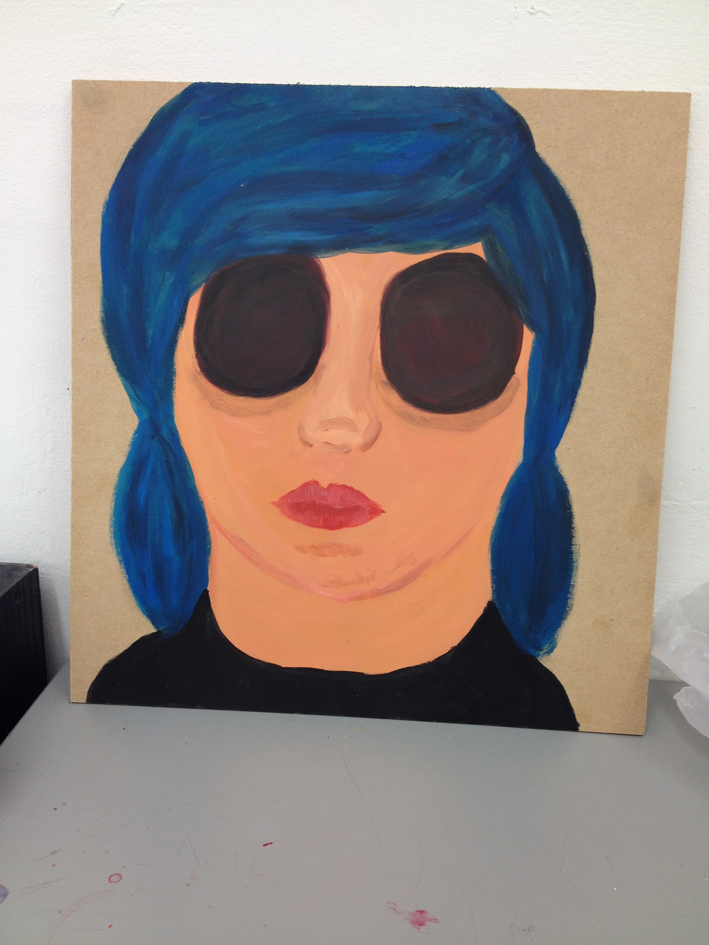
Final Painting – Acrylic on board
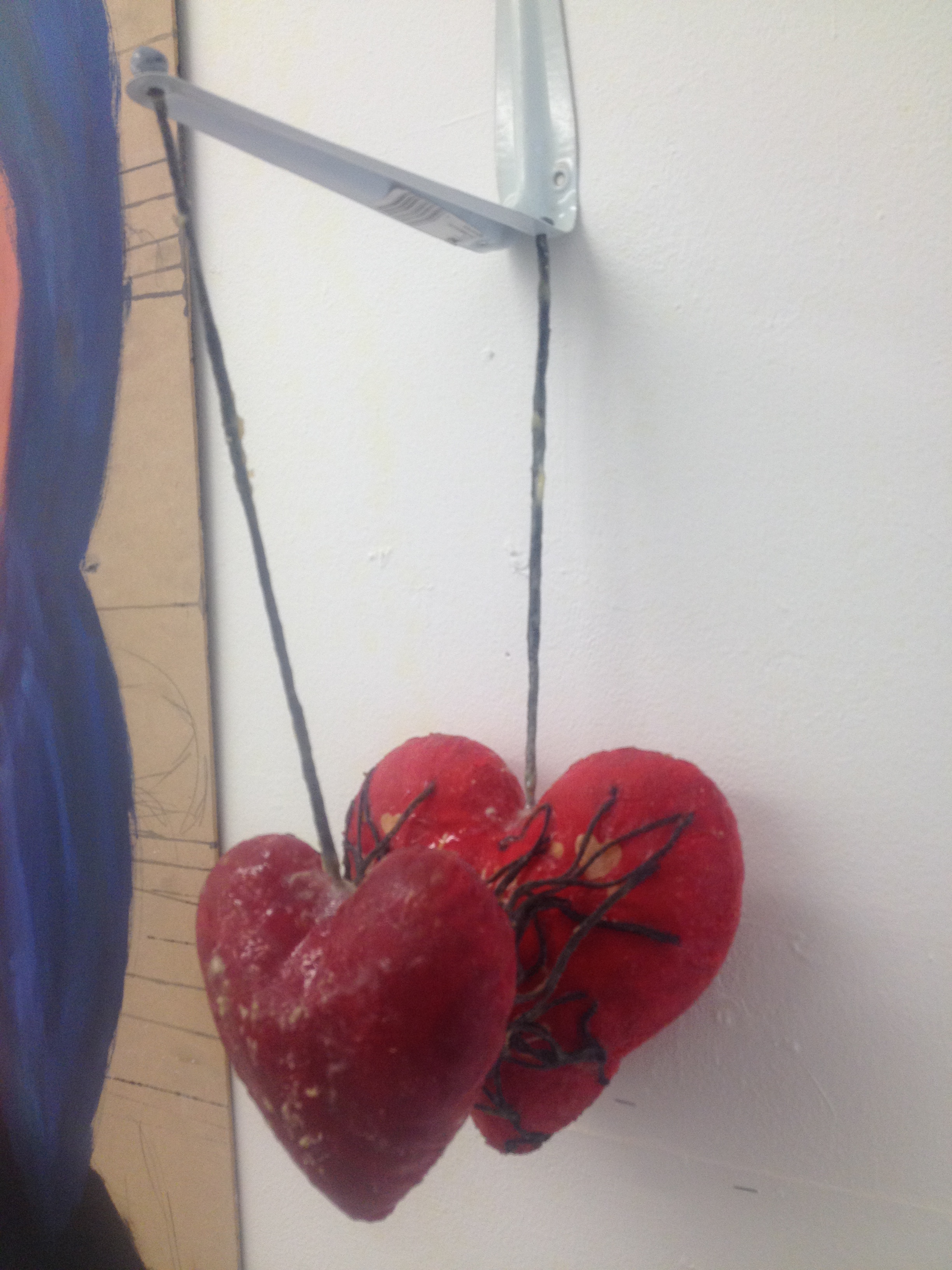
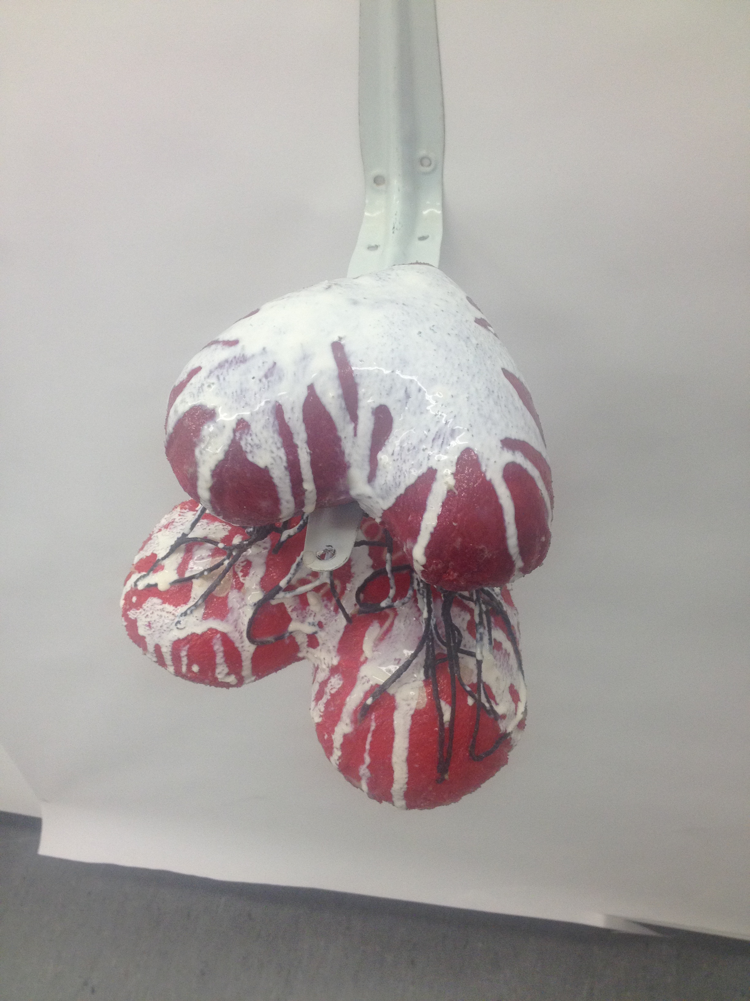
Final Sculpture – Found objects, Latex, Wool

Inside Out – Final Arrangement
Inside out – Evaluation
When I first received the project titled ‘Inside Out’ I really wasn’t sure where I could take the project. I considered the human or animal body and the inside of that such as muscle tissue and bones. I also considered my childhood and using objects or photos of meaning with that. However, I wasn’t too happy with concept of my projects so I decided to go with the idea of Depression as it is something I have struggled with for many years. I have often used my artwork as a way of therapy for myself and I felt that I would have a lot to go off as it is something very close and personal to me.
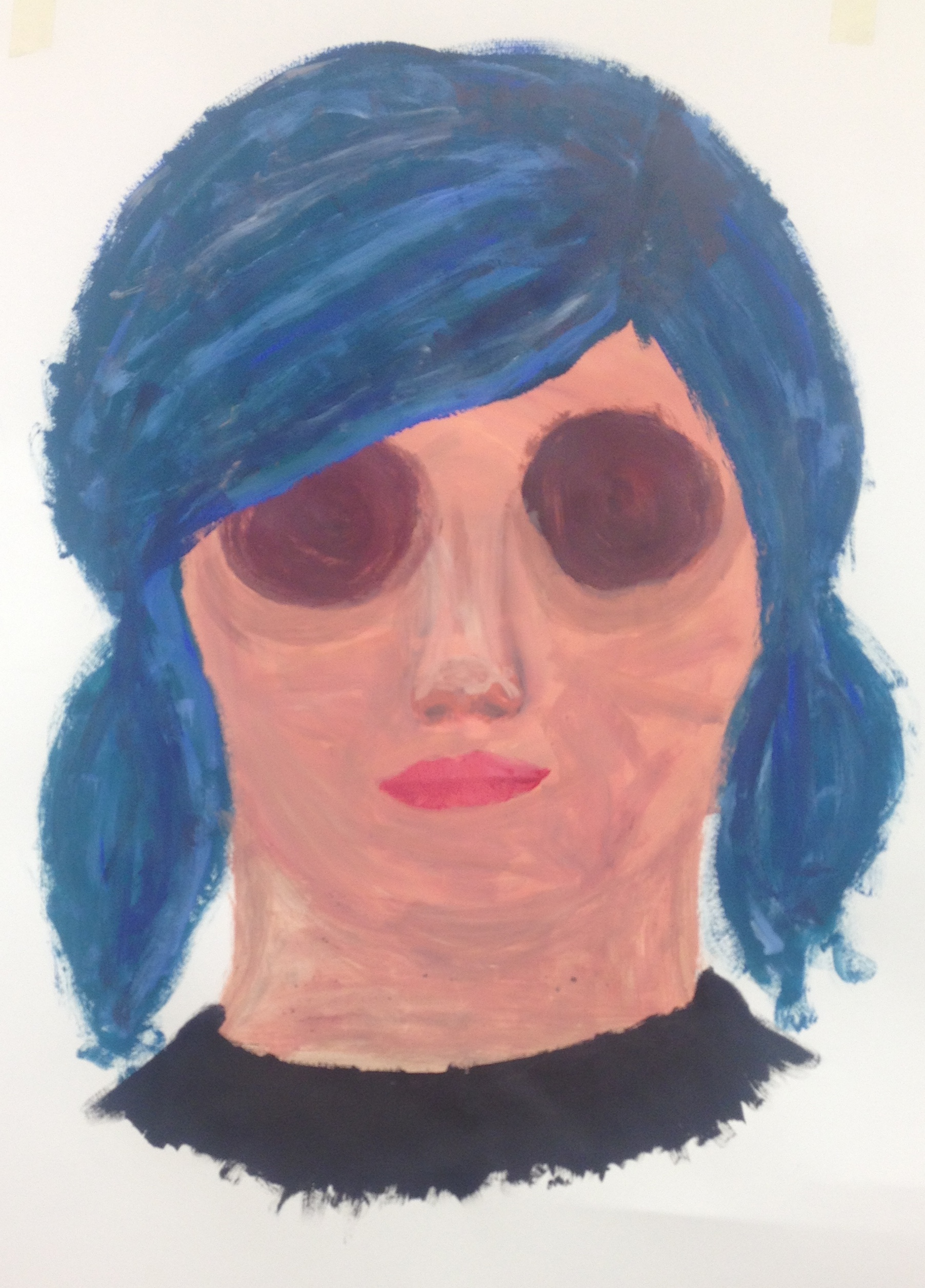
My initial idea of what I could produce for the painting was that I could paint a close up of an eye as when I struggle with my depression on the outside I act as if I’m fine but on the inside I’m not and as people have often considered the eyes to be “the windows of the soul” I felt this could be a good representation of this. However, after a talk with a tutor we came up with the idea of Photoshopping the eyes off of the face to give a completely emotionless face.
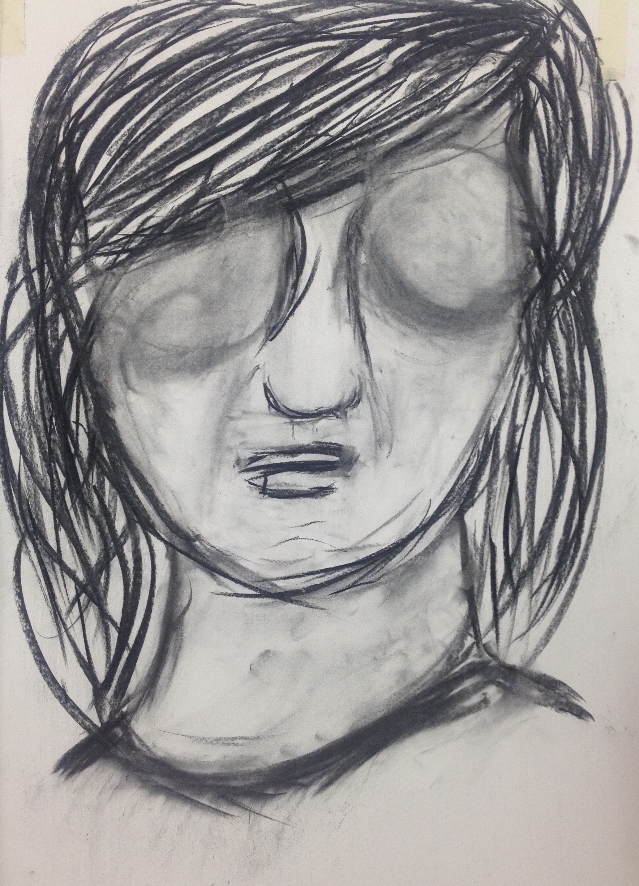
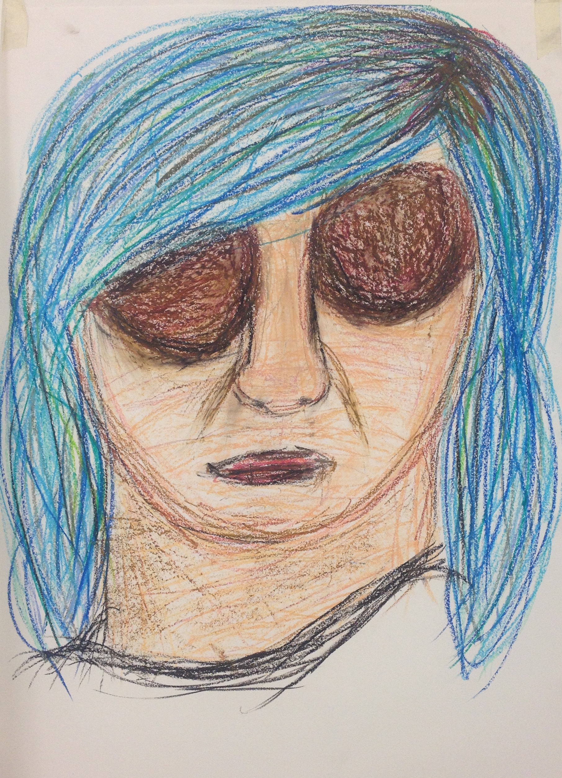
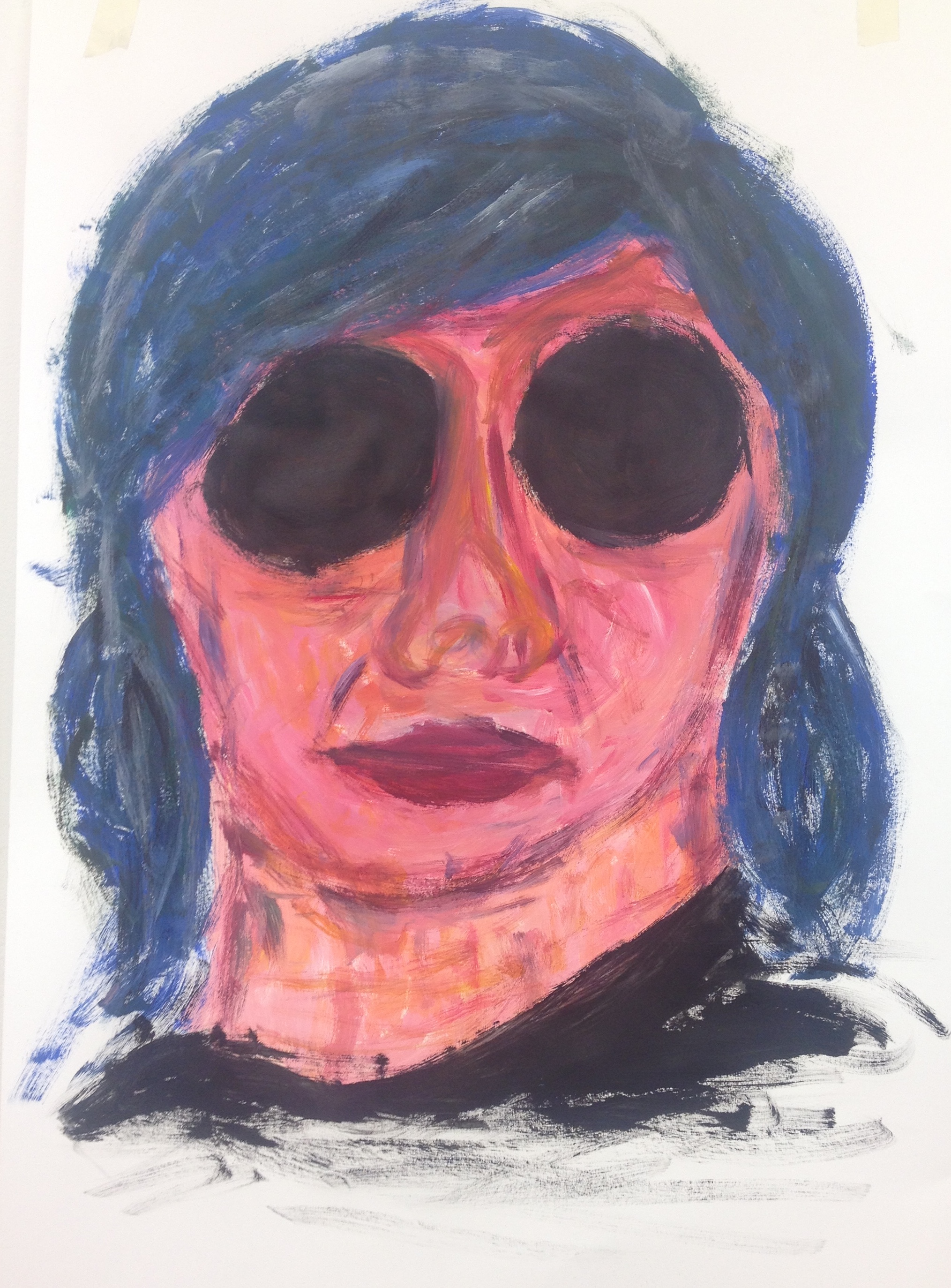
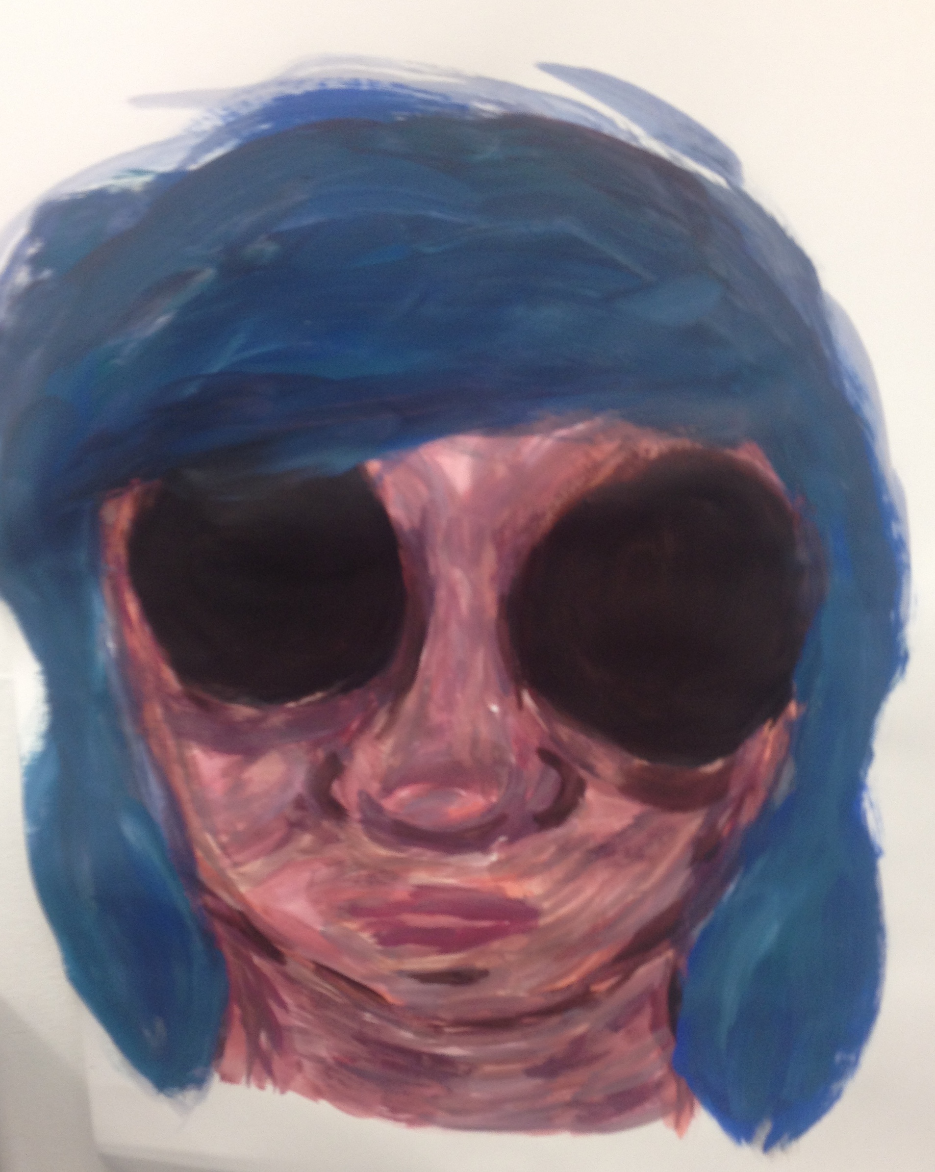
From the rough Photoshop image, I started to do studies in different mediums, I started off with Charcoal and when I added shading to the space where the eyes should be it made them look big and hollow as opposed to blended with the skin like the initial plan. For the second study I used oil pastel, in this one I made the eyes even darker by using shades of brown to contrast from the skin. I haven’t used oil pastels for a long time and I don’t know how to properly work with them so I feel this study didn’t come out well. The third study I used acrylic paints and painted it very quickly and used colour’s you wouldn’t particularly see on a face such as pinks and yellows, as this study was very quick and rushed I decided to create another study using the paints. For this study I took more time blending colour’s and using more skin tones and once again using browns for the eyes to give the hollowed out eyes, I was really happy with the result of this study. I feel the face is a lot more haunting with this style than the previous ones I have attempted. After producing the other studies, I then produced a really quick study with the paint but using a lot of water so that the paint spread a lot, for this one I used small brush strokes with different shades to add a lot of shapes and texture to the face.
For the next study I experimented with scale as for my final piece I want to have it fairly large scale. For the study I used a large piece of paper the size of the wall to create this piece. I used large brushes so I could achieve a similar style to the smaller studies I had been producing. I went with the more expressive style of Study 3 and Study 5 and the bold colour’s too. I enjoyed working at the larger scale however for my final I wanted to use a board to paint on so I think I will scale the piece down a bit.
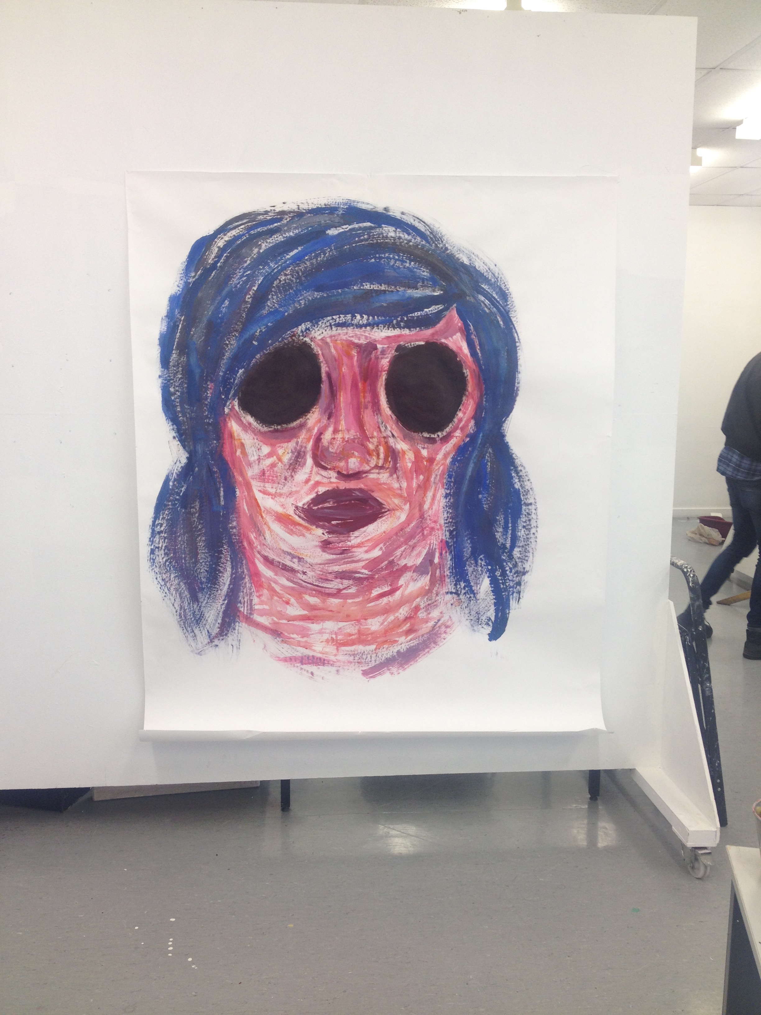
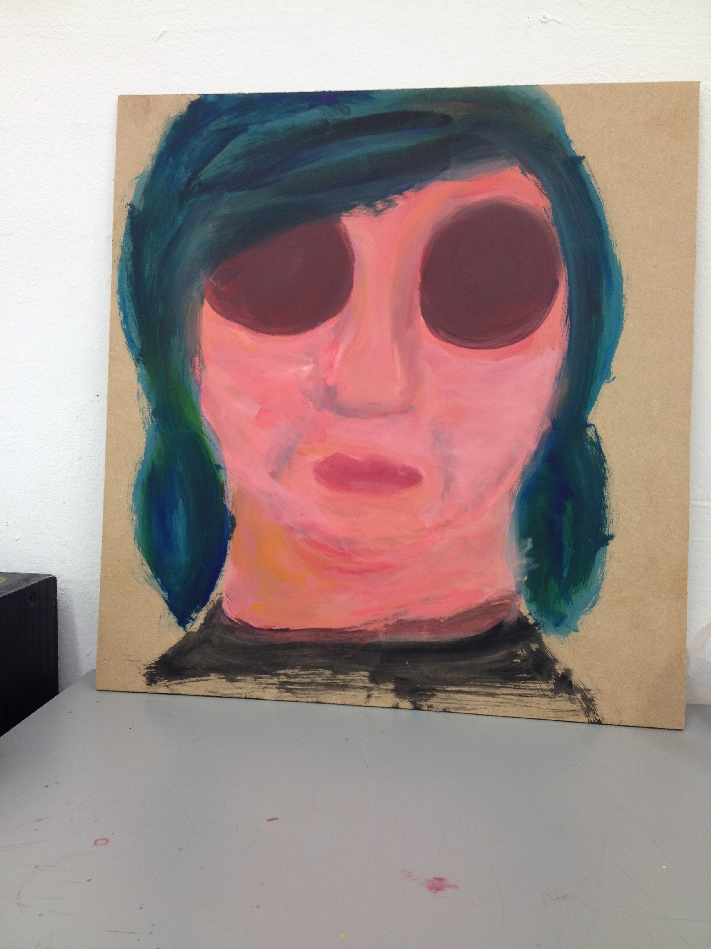
As I wanted to create my final painting on board I decided I would do two testers to choose what style of painting I would do. for the first style I went for the more expressive painting using the bolder colour’s. with this study I feel I didn’t get the same textures into the painting as I had in previous studies on paper. For the next study on board I went for the same style as Study 4 with the flatter colours as I felt that the original was a lot more haunting and had the message I wanted to send. I am happy with this study and feel I will take this into my final piece. The simplistic style helps the eyes stand out more in the painting and makes you look deeper into.
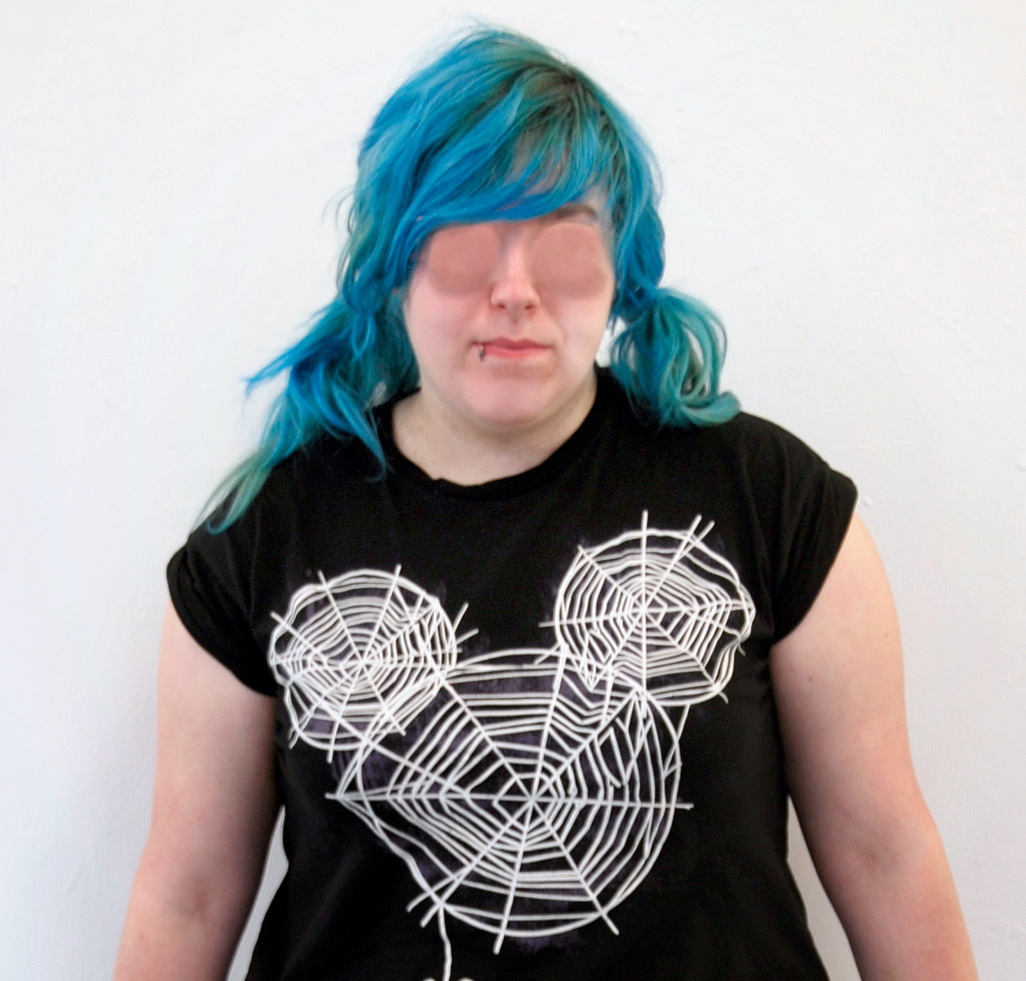
For my final painting I used a large piece of board instead of paper or canvas, I chose this as I liked the the raw material of the wood instead of a crisp white background like paper. I felt this would help my figure stand out more and not be obstructed by the brightness of the background. I went for the flatter style of painting as I felt it would make the eyes stand out more on the board than if there was a more realistic painting with the face. I am pleased with how the painting came out in the end however if I had spent more time on it I would have worked on the nose and lips as I feel the lips needed more texture like I had created with the tester in the same style. I may have also experimented on a bigger scale like I did with the paper with the more expressive style, but in the same style as I chose in the end.
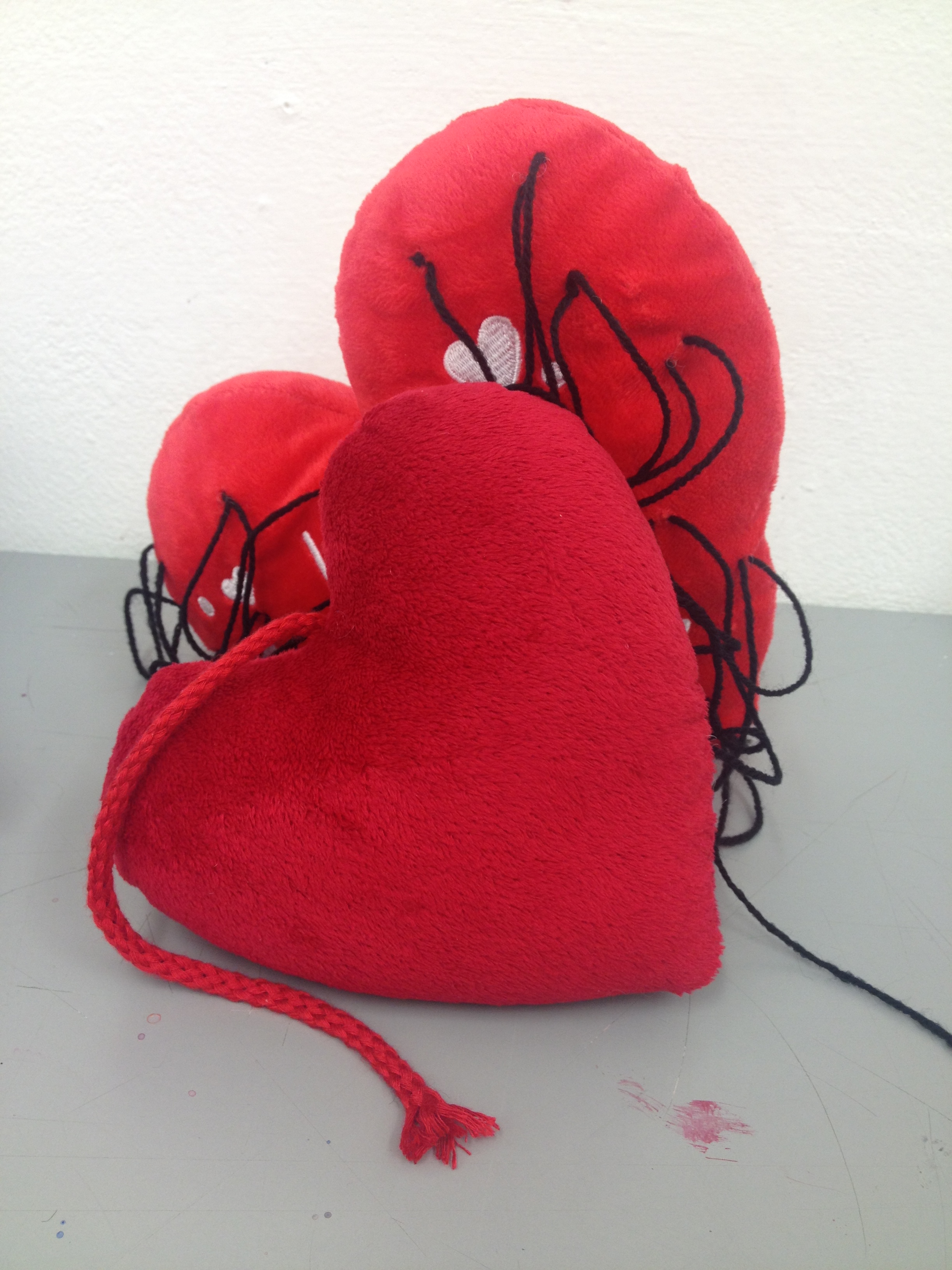
My initial idea for my sculpture was to create a box that contained items that a previous abusive ex boyfriend had bought me after every time he had hurt me, these items included teddies, snow globes and other romantic gifts. At the time these gifts would make me forgive him and not want to leave, but since leaving him I realised how wrong it was for him to just buy me off. I decided I would use these objects as when relationships end they set my depression off really badly, I felt that these objects would offer a way of therapy while destroying them and what they mean. I thought that I could destroy them and fill the box with black string to represent all the bad thoughts I have had during my episodes of depression. I considered having holes in the box as a way of viewing the items, the holes would represent the ‘missing’ eyes from the painting. However, when I was looking at the items I had gathered I was considering what I would do to destroy them before placing them inside of the box, I got on to looking at two plush hearts I had and got onto thinking about stitching the two of them together using the black string I was going to use inside the box. I then had the thought about dipping them in latex to change the texture of them into something gross that people wouldn’t want to touch. Once I had come up with the idea for the hearts I decided that this would be more visually interesting than the box idea.
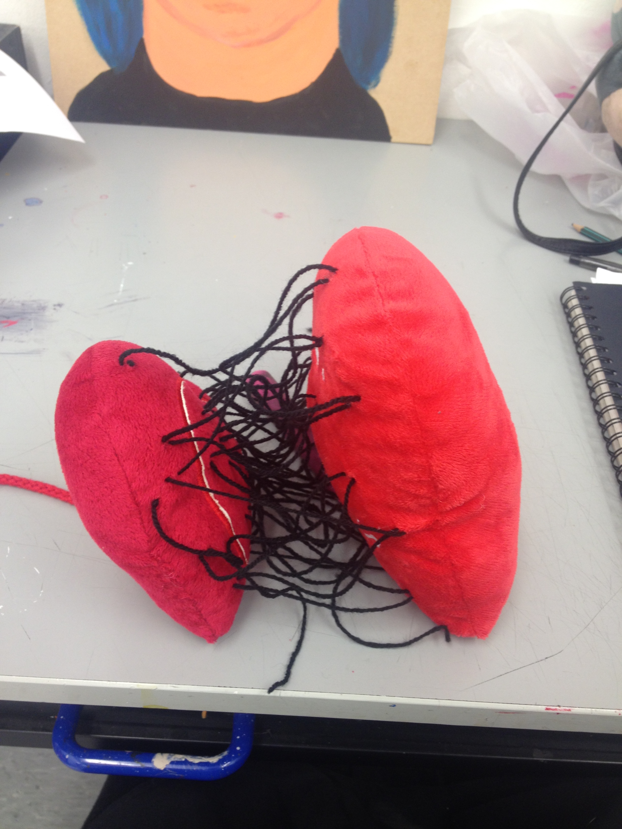
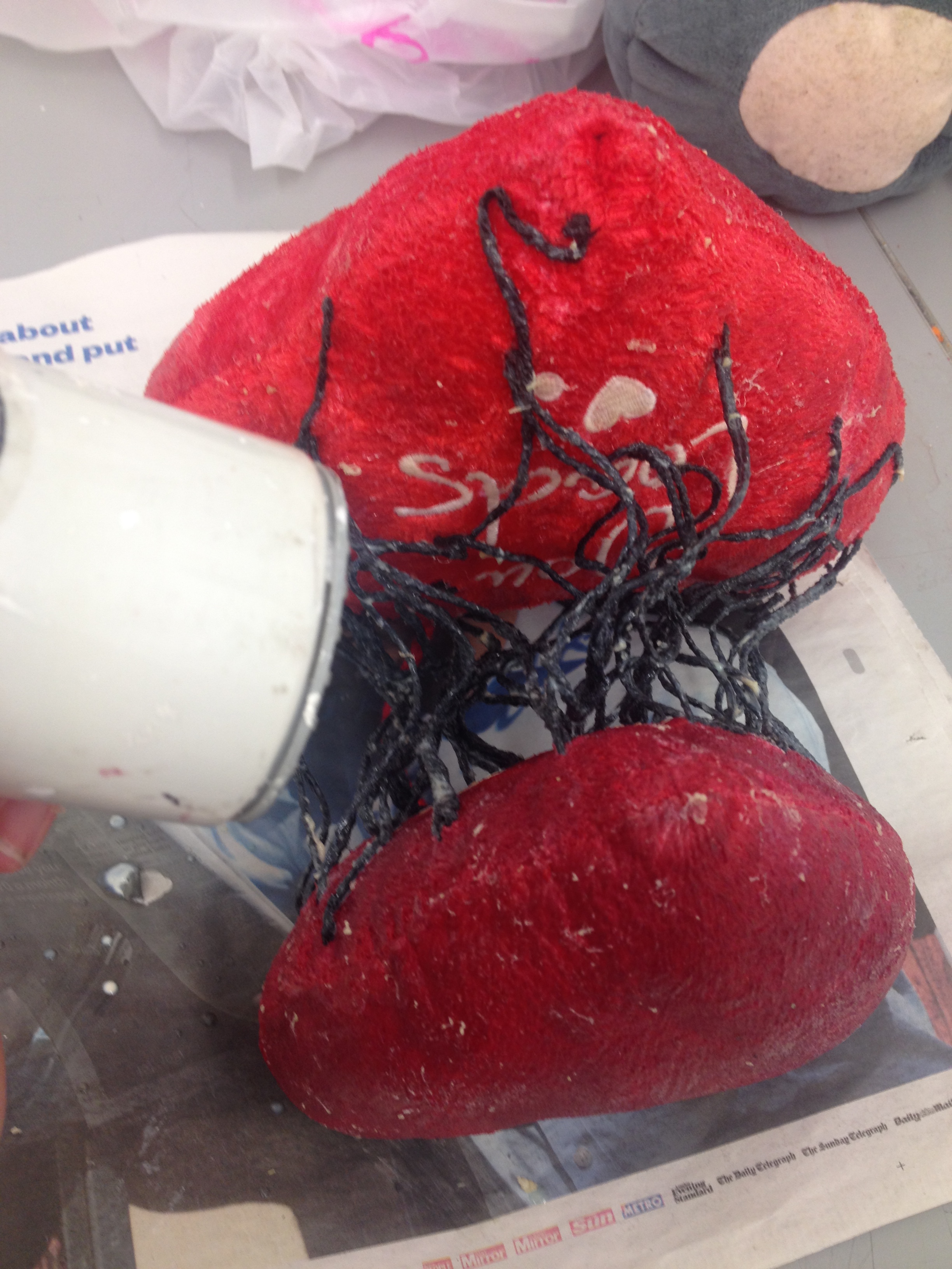
To make the sculpture I started by stitching the hearts together with the black string, I added a lot of the strands so that the centre of the hearts was dark and crowded. I then started layering it all in latex until I was happy with the results. During a critique people all came up with different thoughts and feelings about the piece, one saying the middle was like heart strings and another saying it was like a parent child bond holding them together. I am happy with the end result of the sculpture and feel it provokes inner feelings of people who look at it. Although if I had of had more time on the project I think I would have experimented with some of the other objects I had gathered and destroyed them in some way as well.
Overall I am pleased with the end result of my project and I have learned that it is good to experiment a lot with styles and mediums before deciding on what to do for a final piece.