Inside Out – Sculpture Development

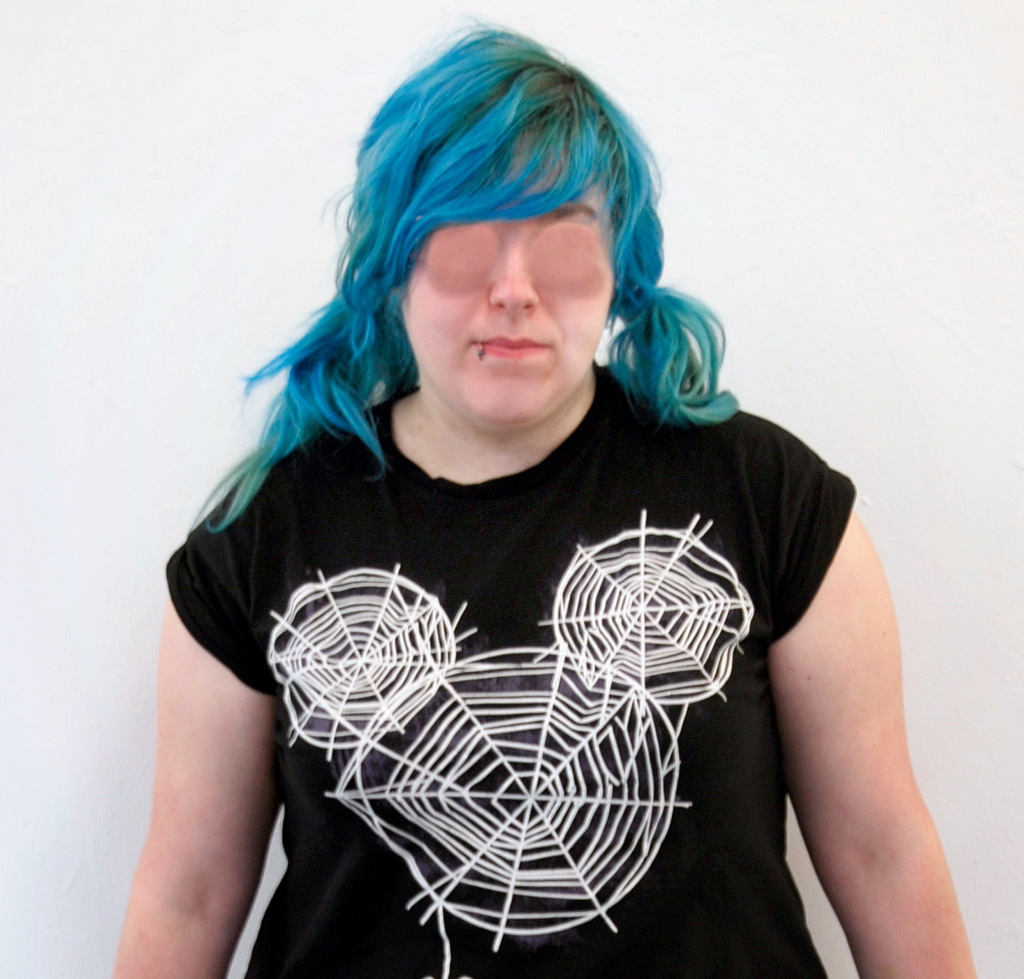
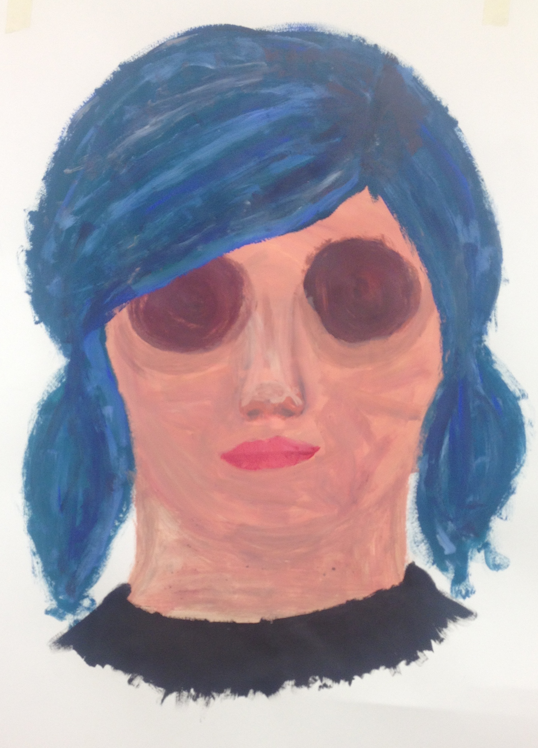
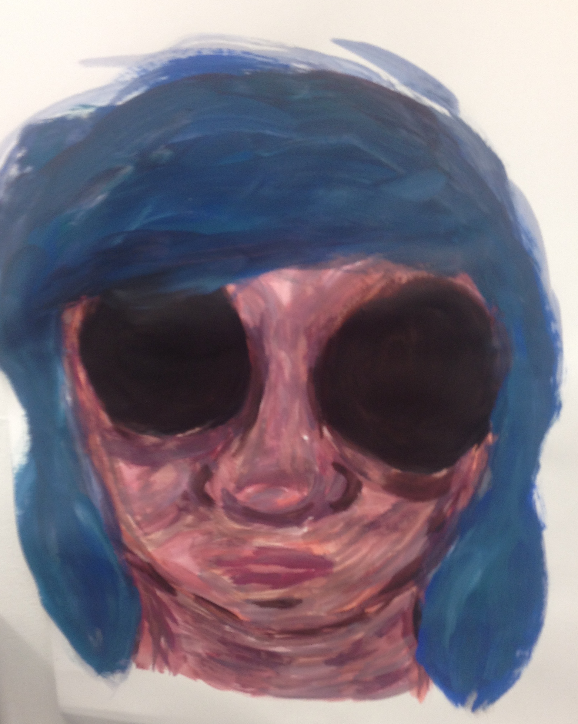
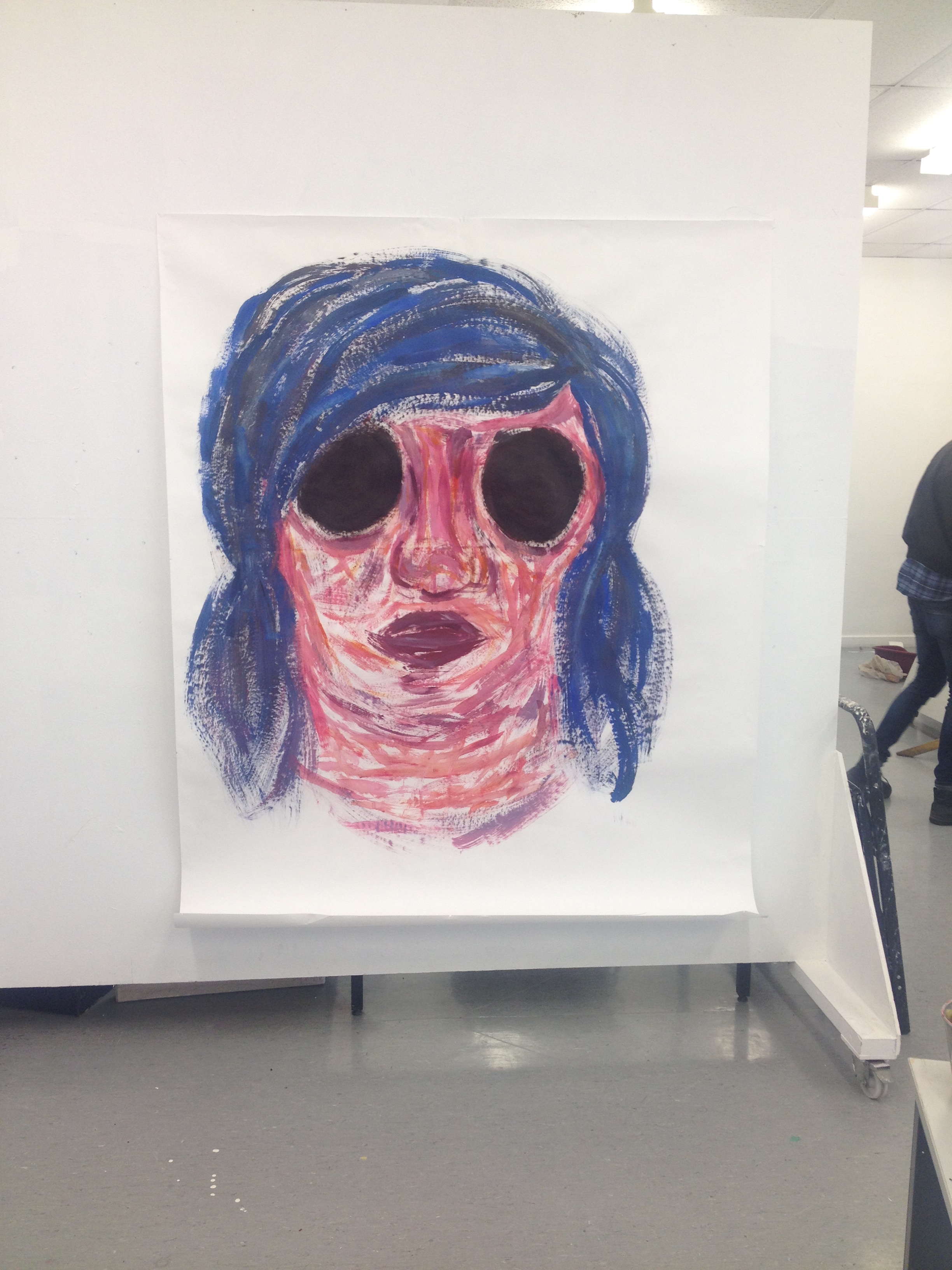
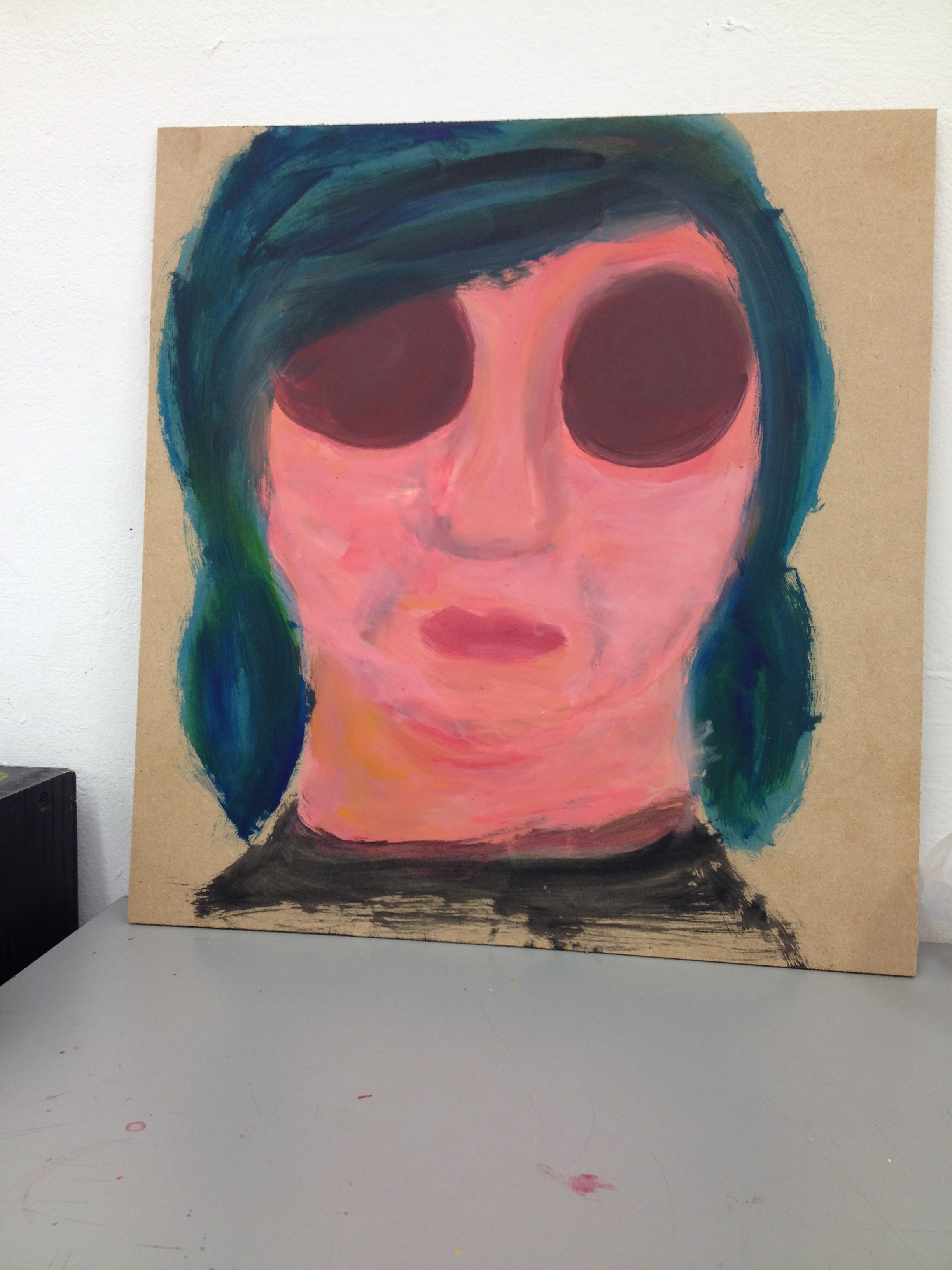
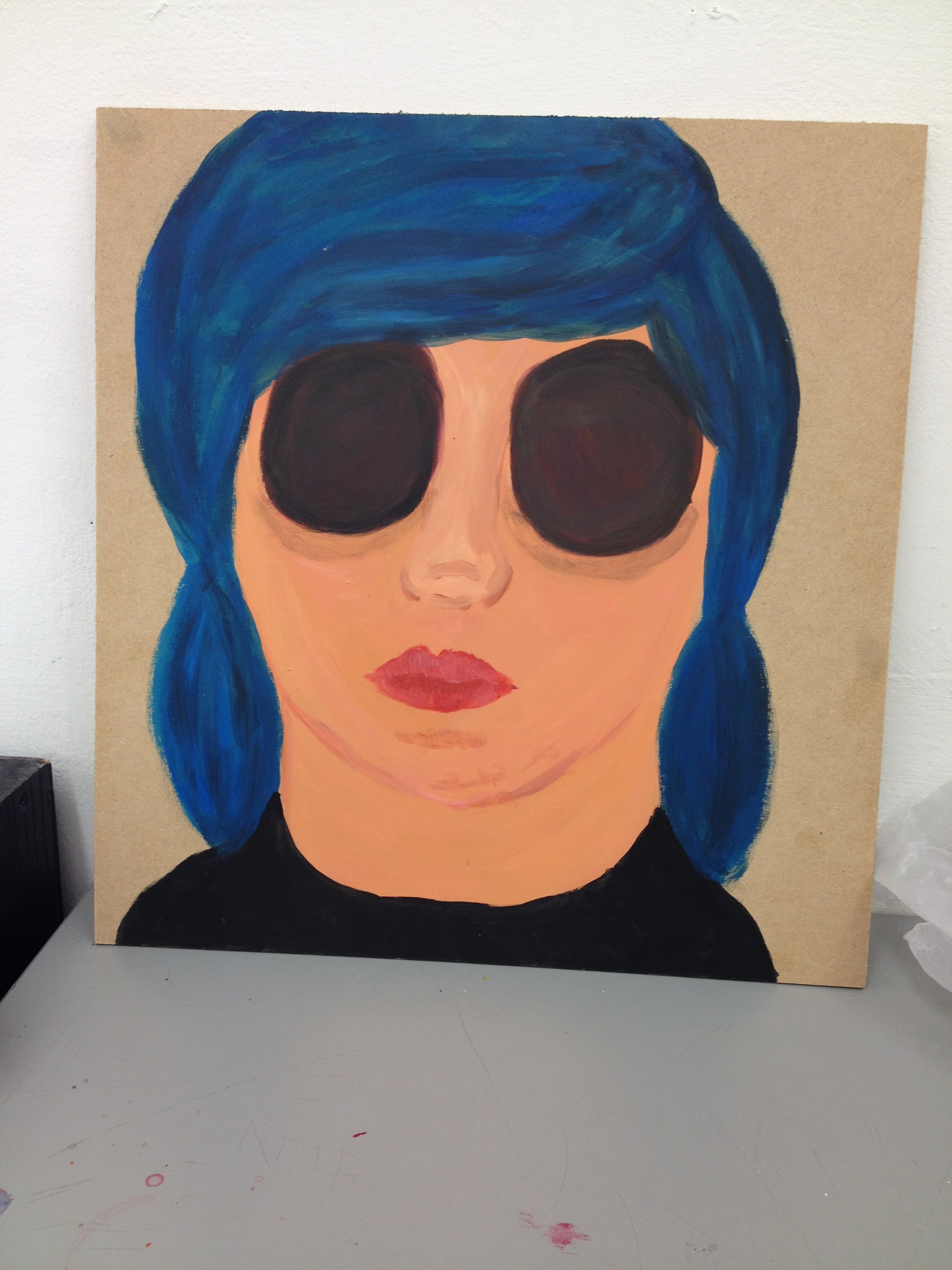
As part of the Inside out project i had to produce a painting and sculpture. For the sculpture part of my project my initial idea was to incase sentimental objects inside of a box. The way the audience would view the objects inside would be through eye holes as if you’re looking through the eyes of the painting. The objects inside would be distorted and destroyed through a web of black string to signify hurt, upset and bad memories.

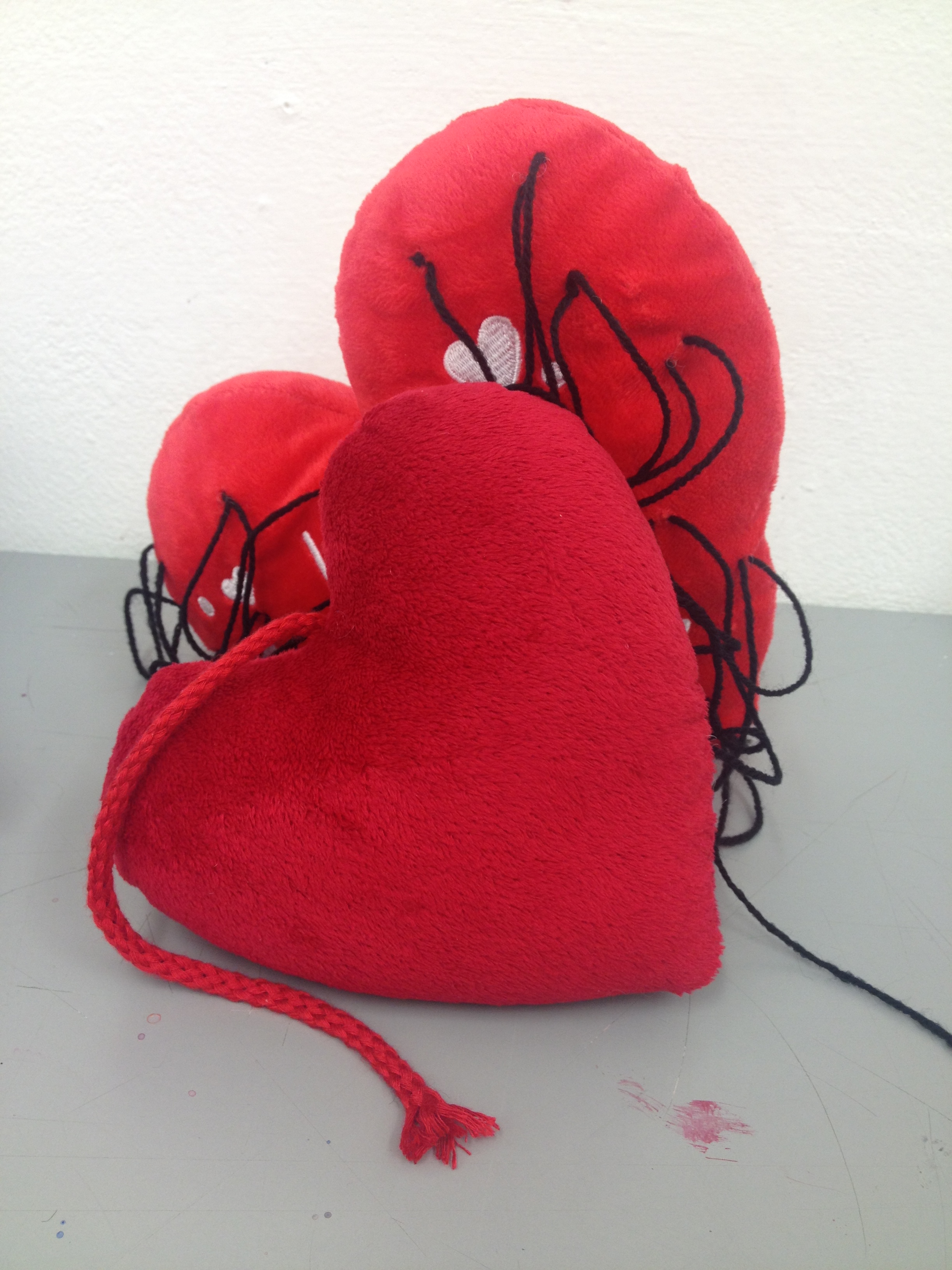
After i had collected a few sentimental objects i didn’t mind being destroyed i was looking at them trying to decided what ones i would end up using. I then started looking at two different sized plush hearts that had been given to me by an ex boyfriend. While looking at them i got the idea of stitching them together with the black string and dipping the whole thing in latex to add another skin over the top of it changing the whole object into a distorted form. I felt this would be more visually interesting than the objects inside of a box.


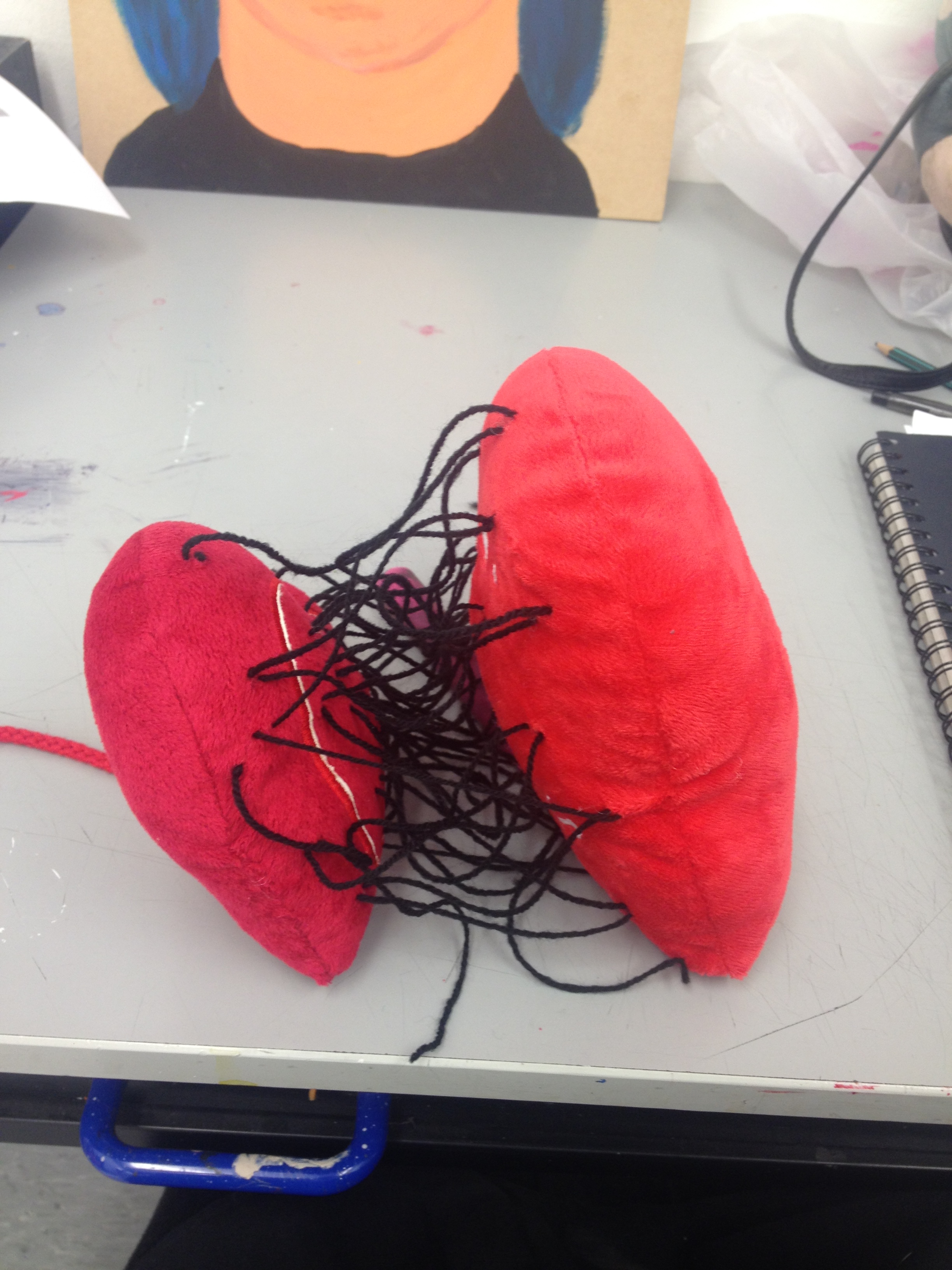
To start the progress of making the sculpture i stitched the two hearts together using the black wool. I added a lot of the string to make the centre of the object much more crowded and dark.

IMG_8764

IMG_8763

I started layering the string and hearts with thin layers of liquid latex and dried in-between layers to make the process go a lot quicker. I originally started layering the latex on with a paintbrush however i found it a lot more efficient to just use my finger to spread the latex more evenly.

IMG_8766

IMG_8769

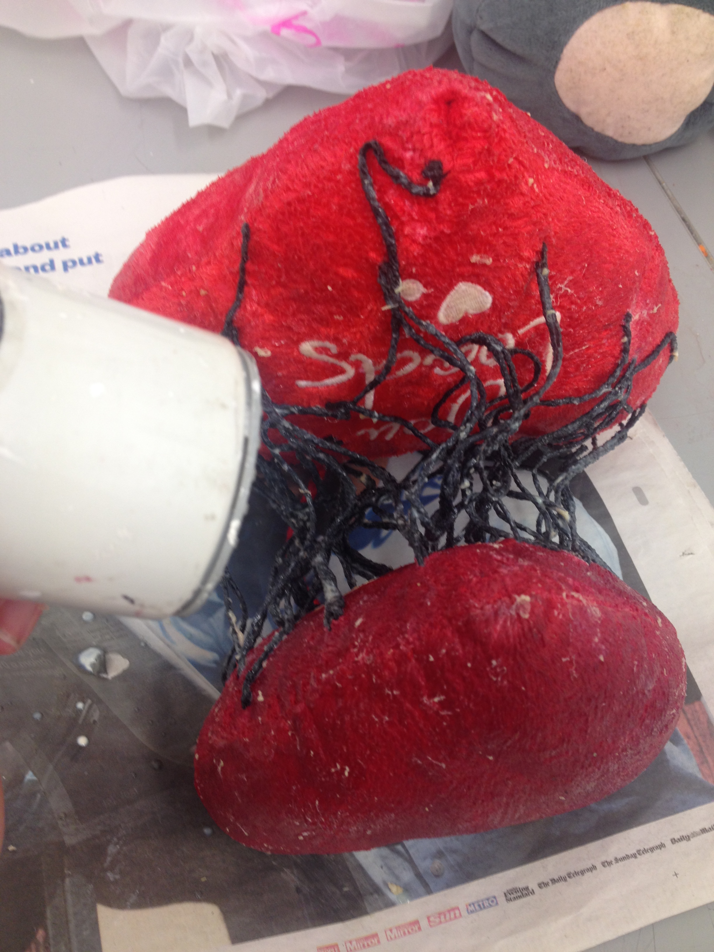
When i wasn’t getting my desired effect from layering the latex i then hung it up so that i could pour more latex onto it at once and left it for a couple days to dry. Once it had dried i liked the drips that had formed onto the larger heart however the smaller heard had dried very smooth and shiny which was not the effect i wanted. i built up texture on the smaller heart by adding latex onto the small heart and letting it partially dry and rubbing it to add in a more bumpy uneven texture.

IMG_8771

IMG_9008

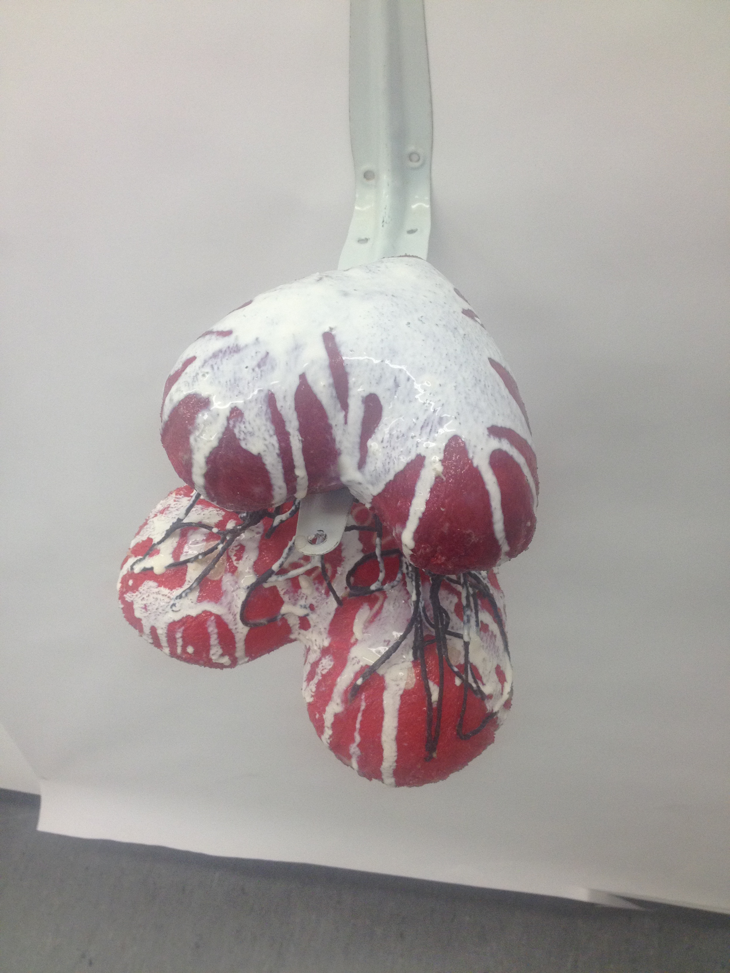
To hang the sculpture i hung it from some string that i had also covered in latex so that it had the same texture as the sculpture. i attached the string onto a shelf bracket however this wasn’t how i wanted it to originally be hung but i was struggling to get it hung up any other way so this is what i went for in the end

IMG_9021

Inside Out – Project Development

When I first received the project titled ‘Inside Out’ I really wasn’t sure where I could take the project. I considered the human or animal body and the inside of that such as muscle tissue and bones. I also considered my childhood and using objects or photos of meaning with that. However I wasn’t too happy with concept of my projects so I decided to go with the idea of Depression as it is something I have struggled with for many years. I have often used my artwork as a way of therapy for myself and I felt that I would have a lot to go off as it is something very close and personal to me.

My initial idea of what I could produce for the painting that I needed to produce for the outcome of this project was that I could paint a close up of an eye as when I struggle with my depression on the outside I act as if I’m fine but on the inside I’m not and as people have often considered the eyes to be “the windows of the soul” I felt this could be a good representation of this. However after a talk with a tutor we came up with the idea of Photoshopping the eyes off of the face to give a completely emotionless face.

Rough Photoshop image to use for studies

Rough Photoshop image to use for studies

From the rough Photoshop image I then started to do studies in different mediums. I started off with Charcoal when I added shading to the eyes that weren’t there I liked the fact that they looked big and hollow as opposed to blended with the skin.

Study 1- Charcoal

Study 1 – Charcoal

for the second study I used oil pastel, in this one I then made the eyes even darker by using shades of brown to contrast from the skin. I haven’t used oil pastels for a long time and I don’t know how to properly work with them so I feel this study didn’t come out well.

Study 2 - Oil Pastel

Study 2 – Oil Pastel

The third study I used acrylic paints and very quickly made the study and used colours you wouldn’t particularly see on a face such as pinks and yellows, as this study was very quick and rushed I decided to create another study using the paints.

Study 3 - Acrylic Paint

Study 3 – Acrylic Paint

For this study I took more time blending colours and using more skin tones and once again using browns for the eyes to give the hollowed out eyes, I was really happy with the result of this study. I feel the face is a lot more haunting with this style than the previous ones I have attempted.

Study 4 - Acrylic Paint

Study 4 – Acrylic Paint

After producing the other studies I then produced a really quick study with the paint but using a lot of water so that the paint spread a lot, for this one I used small brush strokes with different shades to add a lot of shapes and texture to the face.

Study 5 - Acrylic Paint

Study 5 – Acrylic Paint

For the next study I experimented with scale. I used a large piece of paper the size of the wall to create this piece. I used large brushes so I could achieve a similar style to the smaller studies I had been producing. I went with the more expressive style of Study 3 and Study 5 and the bold colours too. I enjoyed working at the larger scale however for my final I wanted to use a board of wood to paint on so I think I will scale the piece down a bit.

Study 6 - Acrylic Paint

Study 6 – Acrylic Paint

As I wanted to create my final painting on board I decided I would do two testers to choose what style of painting I would do. for the first style I went for the more expressive painting using the bolder colours. with this study I feel I didn’t get the same textures into the painting as I had in previous studies on paper.

Study 7 - Acrylic Paint on Board

Study 7 – Acrylic Paint on Board

For the next study on board I went for the same style as Study 4 with the flatter colours as I felt that the original was a lot more haunting and had the message I wanted to send. I am happy with this study and feel I will take this into my final piece. The simplistic style helps the eyes stand out more in the painting and makes you look deeper into.

Study 8 - Acrylic Paint on Board

Study 8 – Acrylic Paint on Board

While messing about with some left over paint I produced this study using different shades of green. I really enjoy the different textures within the paint as it was done fast and with no intention of being an actual study.

Study 9 - Acrylic Paint

Study 9 – Acrylic Paint